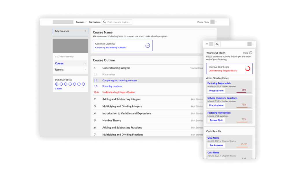
I worked on an edtech platform for students to learn math through video lessons and dynamic practice. The product struggled to keep users engaged through to the actual learning experience. Learners didn't understand how to manage their courses, and well-intentioned personalization efforts were creating barriers.
Introduction
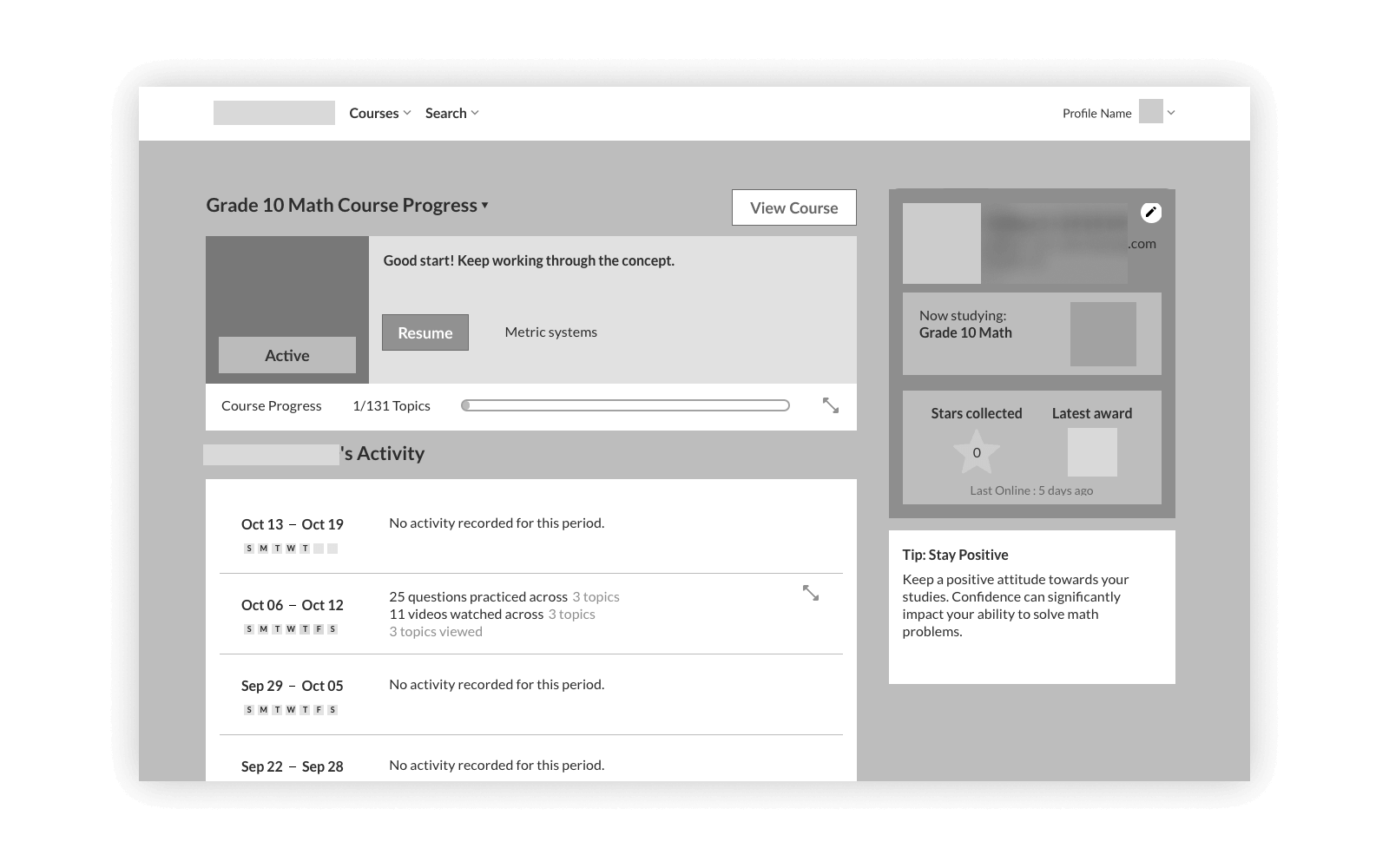
Two major things affected the dashboard: users were dropping off before diving into the learning content, and customers reported confusion with course management, validated by session recordings. When leadership was exploring adjacent offerings beyond the initial subjects, I took the opportunity to solve these problems as well as redesign it for extensibility.
My role
As the solo product/UX designer, I owned the entire design process, under the guidance of my PM: researching competitors, gathering requirements, wireframing, creating mockups, reviewing with stakeholders, and QA-ing the development. Working with a small team without peer designers was challenging, but thankfully dashboards tend to be driven by convention. I had to be disciplined about following established patterns that avoid unnecessary complexity, ensuring a design that wouldn't require a "phase two" to fix usability issues.
The problem
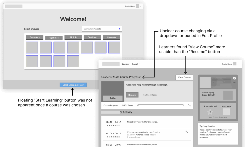
Initially, stakeholders pointed to the welcome screen and onboarding flow as the culprit. Data showed many users were leaving early in the experience; session recordings and user feedback helped uncover two core issues.
- Users were leaving early in the experience — caused by onboarding friction: learners had to complete profile setup before they could access any learning content.
- Expanding beyond math courses — an opportunity to fix non-standard course management: learners couldn't figure out how to switch between grade levels or manage multiple courses.
Understanding learners and competitors
I had to be strategic about research. I focused on three methods:
- User feedback, backed up by session recordings, increasing my confidence in proposed changes.
- Session recordings and analytics, to identify confused clicking in welcome and dashboard screens, plus pageview drop-offs from signup to lessons.
- Competitive analysis, focused on how they manage courses and expose their features without overwhelm.
The new dashboard experience
The redesigned dashboard centres on one principle: get learners learning as quickly as possible. Every decision was made to reduce friction between signing in and starting a lesson, so learners can check out if the content is right for them.
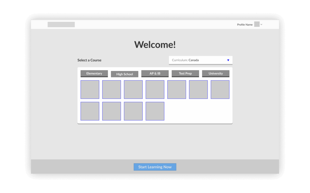
Remove onboarding friction. Before they start learning, we only ask what course they're focusing on. The "Add a Course" button is prominently displayed, teaching learners they can add more courses later — reducing confusion about course management. Before, learners landed on a profile setup screen and a welcome flow before seeing any courses. After, learners land directly on course selection, with their courses front and centre.
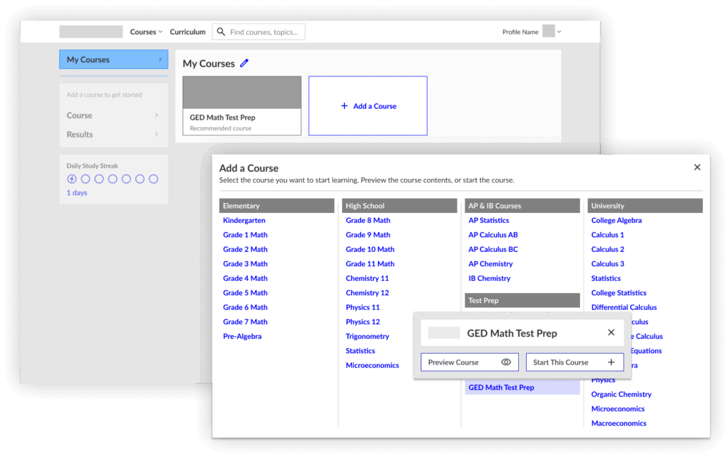
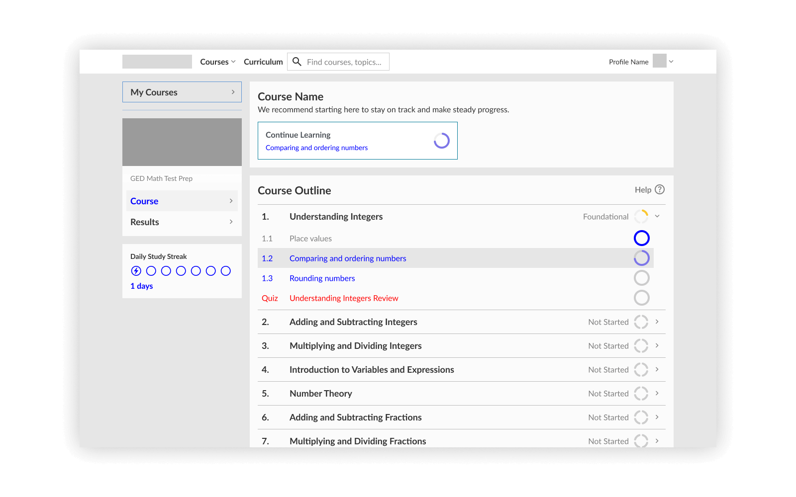
Navigation and extensibility. I incorporated a sidebar pattern that could accommodate more features without needing too much design work. If we wanted more integration, we could feature it in a "recommended" section at the top of each screen as a start. This pattern could now be replicated for other learning tools over time, without requiring major redesign.
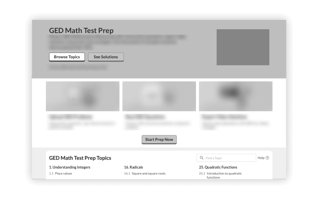
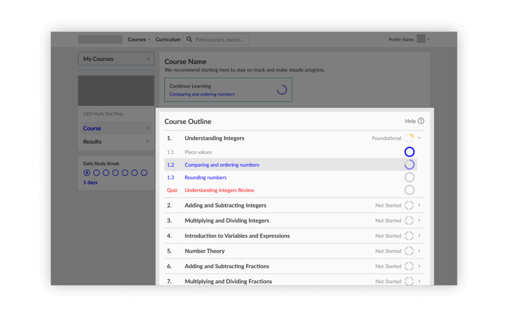
Reduce time-to-learn. By showing the topic list right away, it's easy to follow the course content — and if learners wanted a specific topic, they could use search. Before, topics were embedded in course pages mixed with SEO and marketing. After, all learning activity is moved to the dashboard with a linear list of topics, plus a sidebar for different learning tools.
Impact & results
The redesign launched in mid-2025. I introduced a feedback tool which helped us catch issues quickly post-launch, and provided tangible data to work with. The early results started to validate our research-driven, convention-focused approach. With a little help from AI to interpret the data, I found:
- Usability — ease of finding content substantially improved.
- User satisfaction — customer satisfaction scores increased from a low baseline.
- Time to learn — learners reached their first lesson faster, greatly reducing cancellations.
Challenges & solutions
Related areas of the product showed similar issues with usability according to user feedback, and were candidates for future iteration. It would have been our next step, while also considering that this area's needs have another layer of complexity.
There's some mixing of mental models between the Course dropdown in the header and My Courses in the sidebar. Once broader navigation updates are implemented, this will need to be addressed.
One of the biggest challenges was avoiding the "we'll fix it in phase two" trap. Previous dashboard iterations had shipped with known issues under the assumption they'd be quickly resolved, but resource constraints meant those issues lingered for months.
Working at a small company meant dealing with shifting priorities and limited resources — limited tracking and user testing resources for the learner's core experience, and a requirement to be feasible and intuitive to use, quickly. I leaned more heavily on competitors' established patterns and pushed for feedback tools to catch problems quickly.
Outcome
Despite these challenges, the launch went smoothly because I learned from past iterations, stayed disciplined about conventions — when in doubt, I chose the pattern that users would already understand — and prioritized the right things: getting users learning quickly was always the north star.
This project taught me that I don't always need to pursue innovative design. Users come to learning platforms with expectations shaped by other platforms they've used. Trying new things risks creating more confusion. Sometimes the best design is the most conventional one.
I spent several weeks on competitive analysis, but in retrospect, I should have documented a more formal heuristic analysis of the existing interface. That would have given me even more confidence in my design decisions and made it easier to communicate problems to stakeholders. That said, imperfect research was better than no research — the competitive analysis gave me a framework and vocabulary for discussing design decisions, and the session recordings gave me empathy for users' pain points.
Looking forward, I believe the product can now support more learning tools and more diverse offerings. More than just fixing usability issues, the platform is more able to grow with the business.